Curve Editor
The Curve Editor is where you enter the Stimuli, Measured and Wanted values to view the associated curves. You also have options to adjust the curves, select the ink and further specify the Measured values. Under the curve name you can see when the curved was modified the last time and enter comments.
Ink
Select the curve in the curve set that you are going to edit or view. Each curve corresponds to an ink in the ink set and an ink table.
You can create calibration curves for each of the separation inks and also for spot colors. For more information on Ink options, see “Table Options”.
NOTE: This option is only available for Calibration, and when measurements is one per ink.
Ink Values Table
The ink values table contains the Stimuli, Measured and Wanted values in three columns. The values determine how the calibration curve will look like in the diagram next to the table. At the top of this table you can choose the ink curve you want to see from the drop-down list or using the arrows, if you have more than one ink curve.
You manually edit the values (in dot percentages) to make further adjustments to the curve. The values may be displayed in dot percentages or in densities, depending on the curve options.
Stimuli values
These are the number of measuring points of dot percentages for the test page.
Measured values
These are the values that are measured on the test page, either entered manually or imported from a file.
Wanted values
These are the desired dot gain values in dot percentages for the final print result.
Adding or Deleting Values
Use the Add or Delete buttons to either add or delete a value.
Table Options
This dialog box allows you to specify the required table options for the curve, the inks and the measured values.
Copy/Paste
Use these commands to copy all the data of a table and paste it in another table. You can only copy data from a single table but you can paste this data into multiple tables by selecting multiple tables in the ink table list.
Curve Options
Apply to all
Select this check box to save the settings in the Always applied to all section to all tables or deselect it to save the settings for the selected curves only. Apogee Prepress remembers the state of this option between sessions.
Smooth curve
This option will smoothen the curve around the measuring points. If this option is not selected, the measuring points will be connected with straight lines.
Curve through measurements
This option forces the curve to go exactly through the measured points.
Smooth curve + Curve through measurements
If you select both these options, Apogee generates a smooth curve that goes through the measured points.
Minimum
Select this option if you want to have a minimum value at which the compensation curve starts. All values below that one will be clipped to the minimum value (Wanted values).
Clip to 0 below
Every value in the compensation curve below the specified percentage in the field, will become 0 (Wanted values).
Maximum
Select this option if you want a maximum value for the compensation curve. All values that are higher, will be clipped to the maximum value (Wanted values).
Always keep 100
All the 100% values will be kept as 100 in the transfer curve.
Apply limits to
Select the curve that you want to apply the minimum and maximum limits to.
•Wanted curve: Limit the compensated curve so that the resulting printed output reaches the specified limit. As a result, the values for the limit you will see on the compensated curve will be different than the ones specified.
•Compensated curve: Limit the compensated curve to the specified values.
Resolution
Select the resolution of the curve: Standard or High (slower).
Reset
Choose this option if you want to fill the table with new values. You will have to go through the Initialize dialog boxes again to specify whether you will manually enter the values or import them. See “Create Table”.
CAUTION: Clicking this button will delete the previous table values.
Import/Export Data Sets
You can exchange the table data with other applications such as PressTune. The main difference with the other exchange methods is that this method exports and imports a multi-set data XML file, only containing the data points of the different inks and possible front/back sides.
Print Settings Button)
Opens the print job details regarding stock and screen type. See “Calibration Print Settings” and “Linearization Print Settings)”.
Options Button
Click this button to access the Global Options dialog box. You can make further adjustments to the curve sets and access the different options for the Measured values.
Sets
First you can select whether you want curves One for all sides or One per side of a sheet, and you can also specify the number of webs. Then you specify settings for the curves you want per ink.
NOTE: This tab appears only for calibration curves, not for linearization curves.
Measurements
You can either select an ink set per Ink or an Ink Set for all Inks. Select the required option from the drop-down list:
•One set per ink: Allows you to edit the CMYK curves separately.
•One set for all inks: The values for the three columns only need to be entered once - the curve will be applied to all separations.
Compensation
Select the appropriate compensation curve option from the drop-down list:
•One for all inks: Apogee will calculate the average of the four compensation curves (C+M+Y+K /4)to create one compensation curve for all separations. This option can only be selected if ‘one set per ink’ is chosen from the Measurements list.
•One per ink: Creates a separate compensation curve for each ink.
•One for black, one for the rest: Calculates the CMY average to create a compensation curve for these inks, and creates a separate compensation curve for black.
Weighted average
This check box is displayed if Measurements is set to ‘one set per ink, and Compensation is set to ‘one for all inks’. You only need to enable the weighted average option when working with Sublima screens (for better results).
Compensate unknown colors as
Select a process ink or spot color whose compensation curve will be used for spot colors. Choosing Spot Colors in this list adds this option to the Ink drop-down list in the Curve Editor so a dedicated curve can be created for spot colors.
Measurements
The values in the Measured column are in
Specify how the Measured values will be expressed. You have two options.
Dot %
Express the Measured values in dot percentages.
Density (more accurate)
Express the Measured values in densities.
Dmin and Dmax
Specify the minimum and maximum densities.
Maximum density settings that are too low, will clear up the printed images. Dark areas will not appear dark enough.
Maximum density settings that are too high will blur the printed images in the darker areas.
Refer to the user manual of your output device to see what the appropriate maximum density level is.
NOTE: These options do not apply to Simulation curves.
Print Button
Click this button to either print a test page or a verification page.
Not compensated
Test page with non-compensated values: Select this option if you want to print a test page. You can use this test page to measure the dot gain with a densitometer. This way you will obtain the Measured values that you can enter in the Values table.
Compensated
Test page with compensated values: Select this option to print a verification page. This page already contains compensated values. You can use this page to check whether the output devices have been calibrated correctly.
On
Select the tray which the test page will be printed.
NOTE: This button is only available for Linearization.
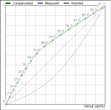
Chart Panel
This part of the editor displays the curve as selected in the Display drop-down list below. See Display Curve Options for more information on the display options.
The different curves reflect the entered values in the Values table and are displayed on a X-Y axis system.
Every curve in the chart has a specific color. The curve that you selected in the drop-down list below, will be highlighted.
•Wanted curve: Black
•Measured curve: Blue
•Compensation curve: Green
•Error curve: Red
Display Curve Options
In this drop-down list, you can select which curve you want to see. For every of the four options, the selected curve will be highlighted.
Wanted
This option highlights the curve for the Wanted values as specified in the Wanted column.
Measured
This option highlights the curve for the Measured values as specified in the Measured column.
If there is a difference between the Measured values and the Wanted values, the curve will not be linear. This deviation is then compensated by the Compensation curve.
Compensated
This option highlights the Compensation curve (green) for the discrepancy between the Measured (blue) and the Wanted values (black). Both curves neutralize each other resulting in a linear curve producing the desired results.
The screenshot below shows a compensation curve for a 20% difference between the Wanted and the Measured values.
 |
Error
This option displays the deviation curve between the Measured values and the Wanted values. The screenshot below shows a deviation curve for a 20% difference between the Wanted and the Measured values.
 |
doc. version 13.1.1